
via awesome.good.is
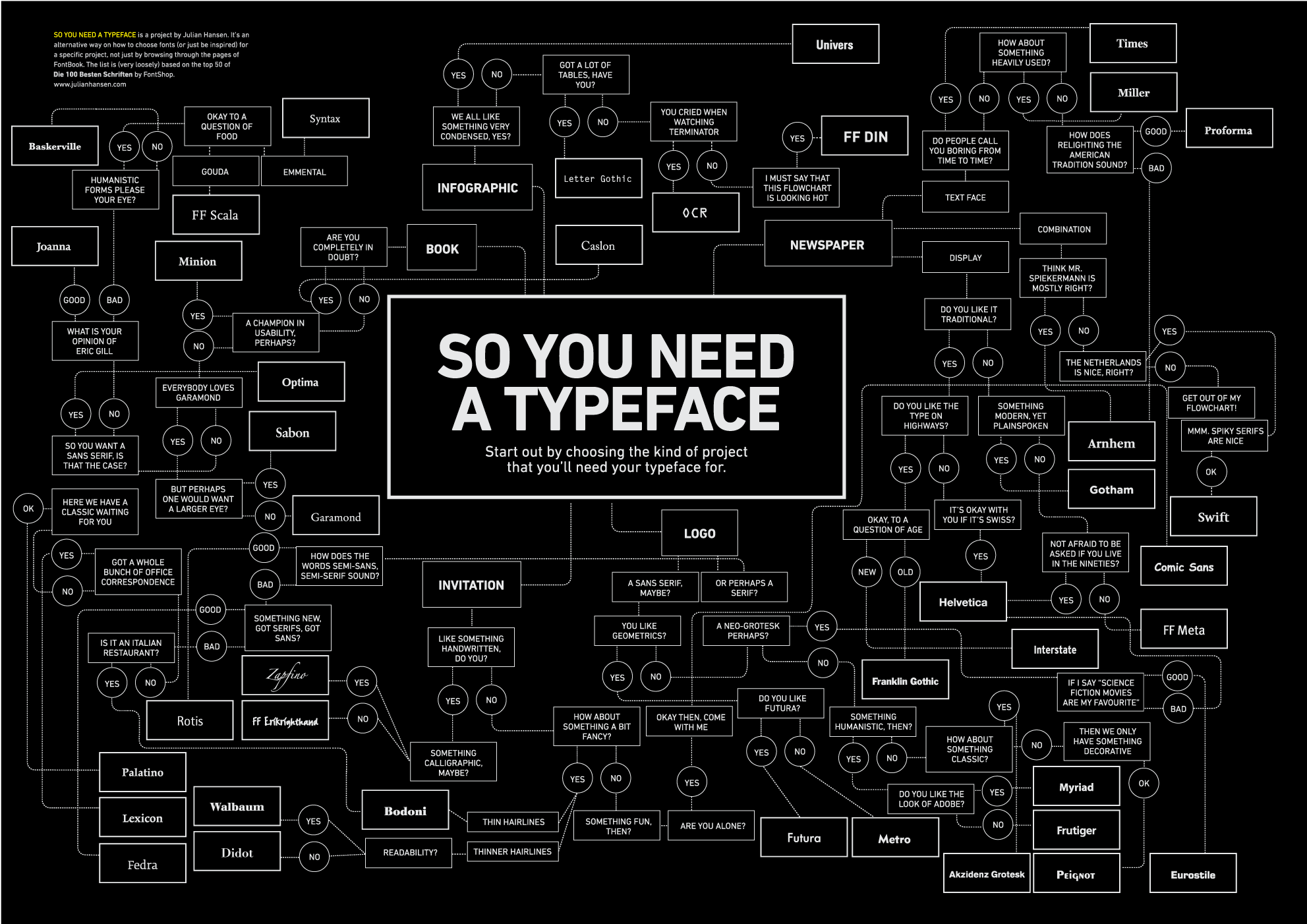
Interesting graphic showing global emissions, increase and decrease per country, and ranking from 2006-2007. The dark circles show emissions increases, the pale ones show decreases. The size of the circle shows the relative size of the percentage change.
I wonder what the current figures are?


